Warm · CC-B14
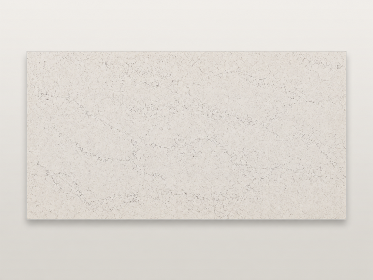
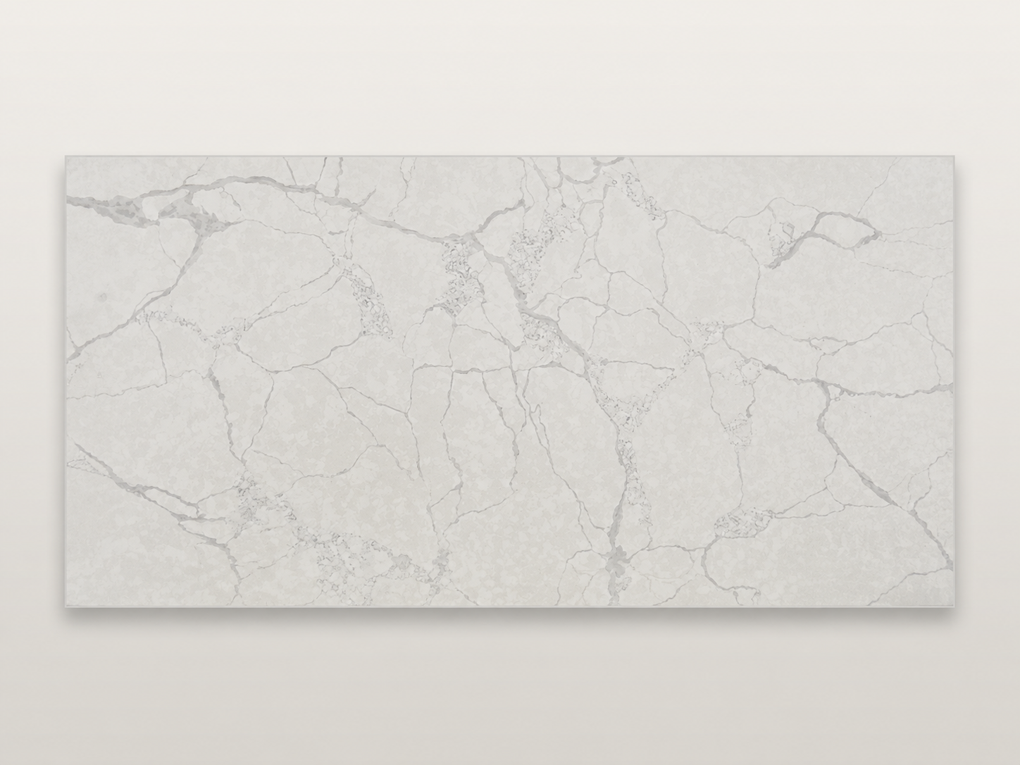
Warm Ivory
Pairs withA warmer, textured white
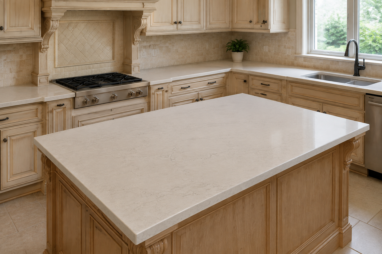
Warm cream-to-ivory with busy, fine grey-taupe veining. It is a warm, quiet backdrop rather than a crisp white, so confirm the exact undertone and how busy the pattern is on a sample.
Get your price with this stoneWhat this looks like in a kitchen
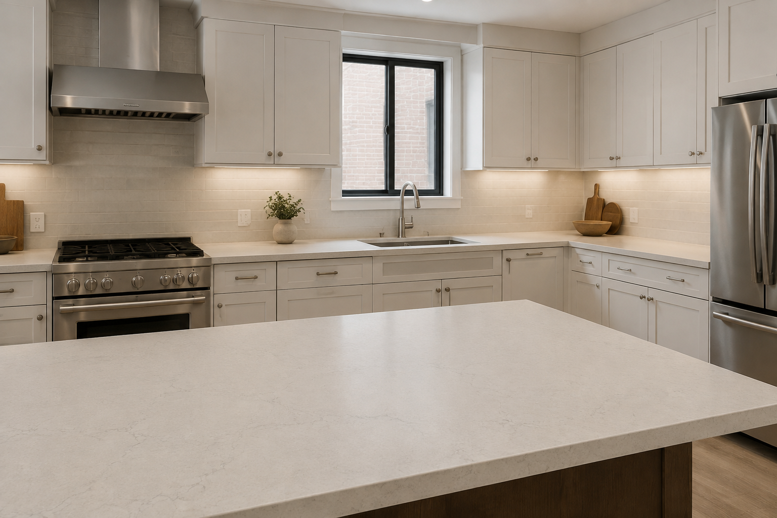
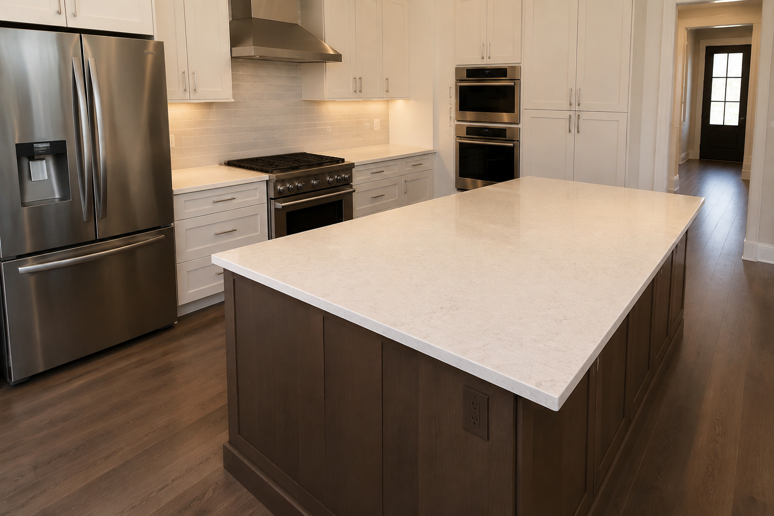
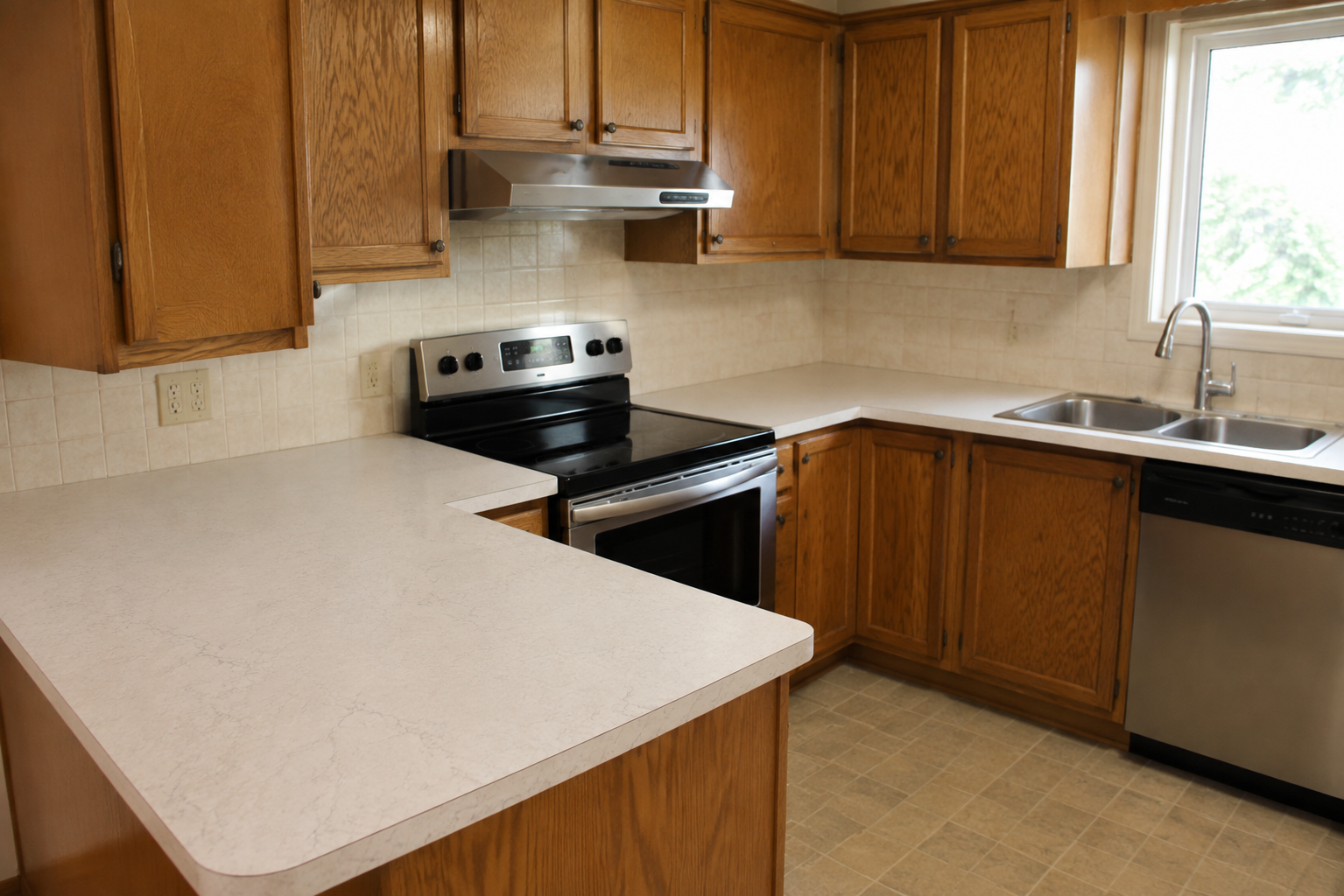
Warm cream-to-ivory with busy, fine grey-taupe veining. It is a warm, quiet backdrop rather than a crisp white, so confirm the exact undertone and how busy the pattern is on a sample. The undertone is warm, so it sits with cream, wood and brass and can fight a bright-white or chrome scheme. Kitchen lighting and the cabinets around it change how the colour and any veining read. It can look softer, warmer or cooler than the slab photo, and a large run shows more than a single sample does. Quartz is made in batches, so tone and veining shift slightly from slab to slab. It is worth judging from a full sample in your own light rather than from a screen.
When to choose it
Best for a warmer, textured white. Pick it when your cabinets, floor or hardware already lean warm; a cool white or grey next to warm wood tends to fight it. It works most comfortably with the cabinet and backsplash tones in the Pairs with line above. See a full sample against your cabinet door in daylight before you decide.
We confirm the exact slab with you before anything is cut.
Compare similar looks
Warm Calacatta
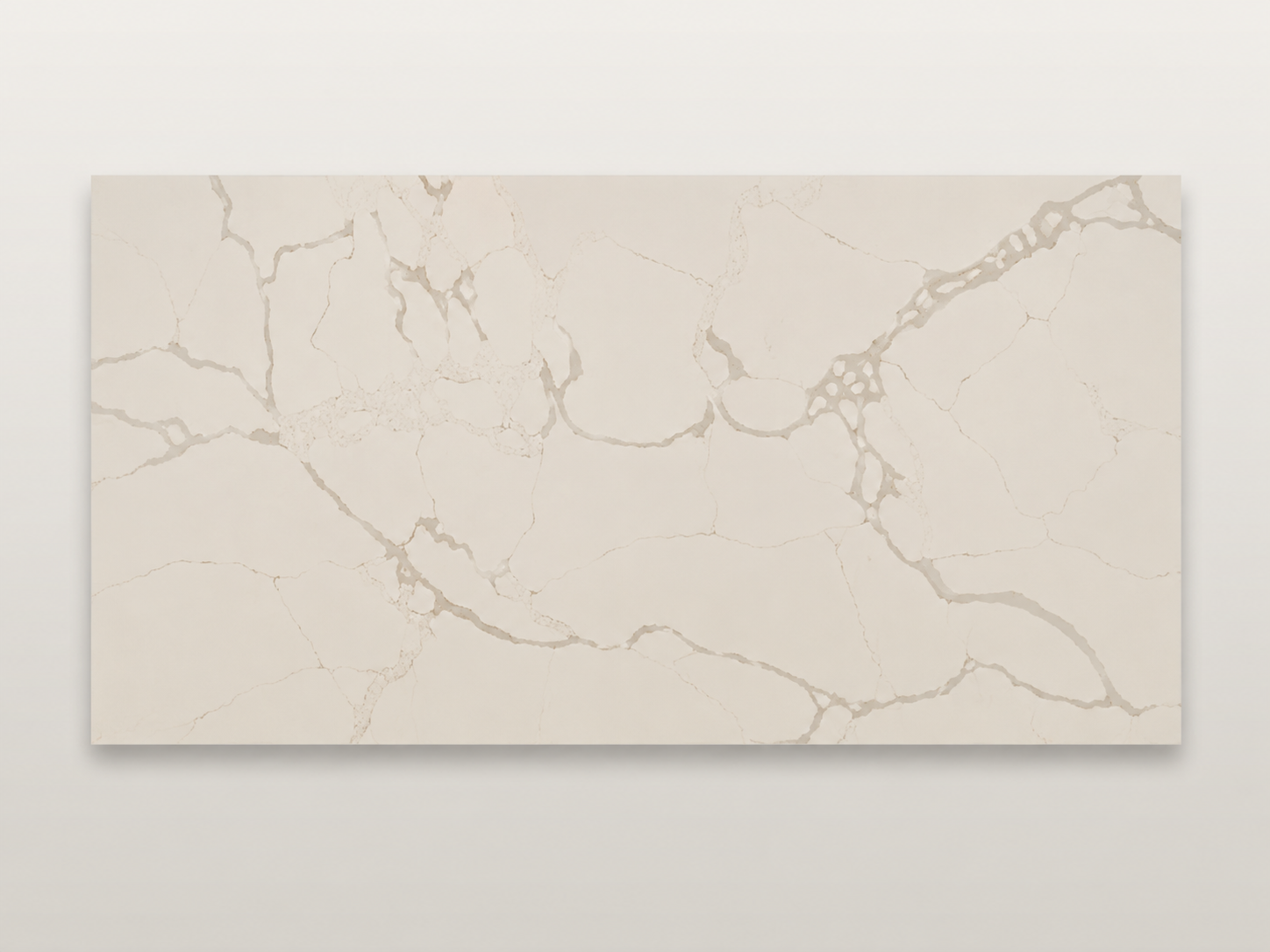
Cream with soft taupe-gold veins, warmer than a true white. It leans into a wood-and-brass kitchen and fights a bright white or chrome one; the supplier photo runs warm, so confirm the undertone on a sample.
Calacatta Gold
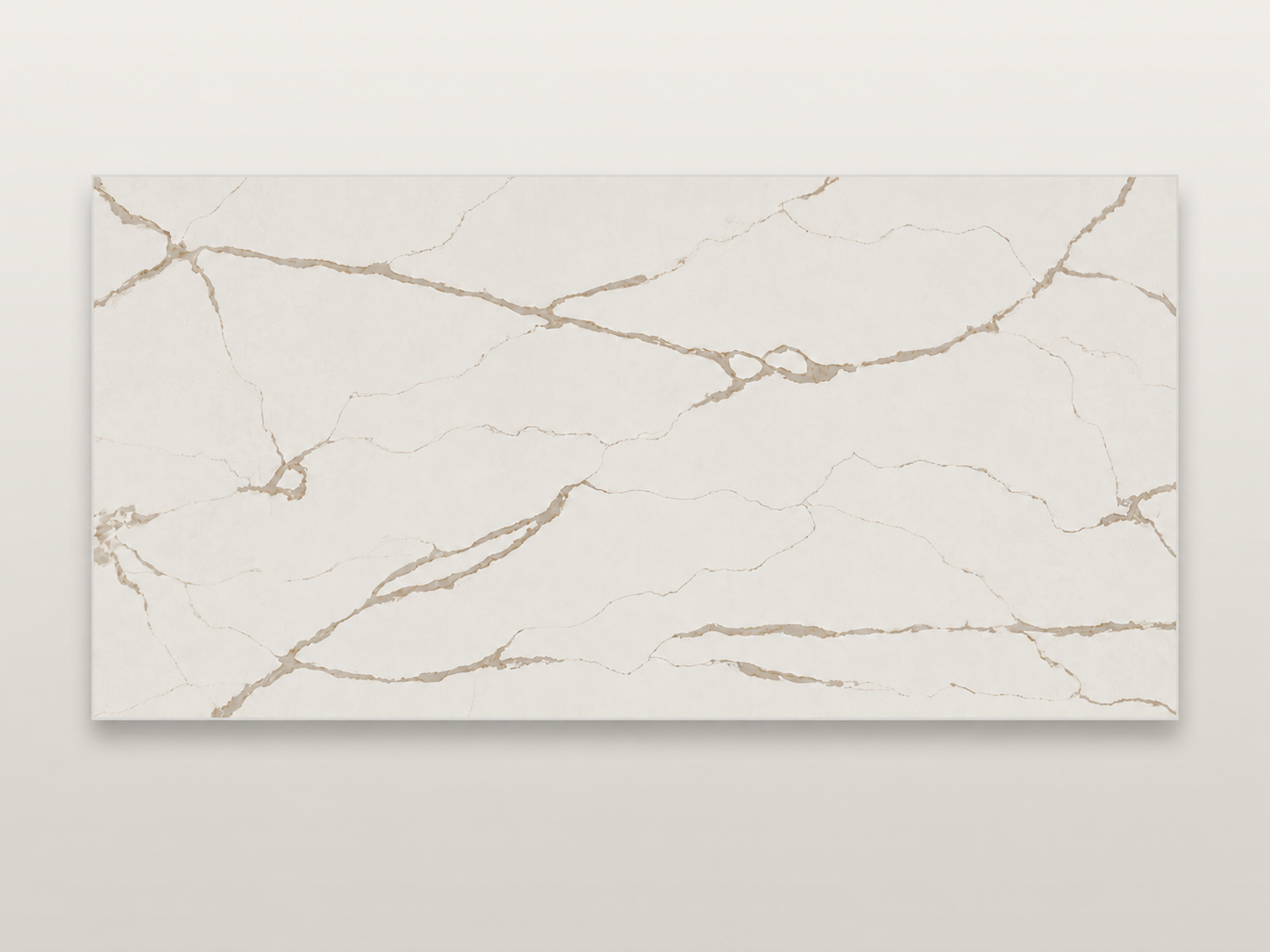
Warm white with clear gold, taupe and beige veins. It is the warm, gold-veined marble look, and it commits the room, so build around brass and wood rather than chrome and cool grey.
Cloud Grey
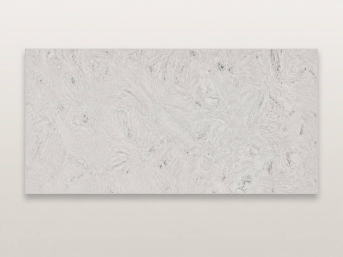
Pale grey with soft grey clouds and no hard veins. It reads more as white with grey weather than a true grey, and it stays soft and cool.
Greige Marble
Light greige to off-white with soft grey veins. It has a few faint mineral clusters and reads as warm greige rather than a flat grey from a distance, so if you want the counter to look properly grey, this is not it.